Name Badge – What Should Be On Them?
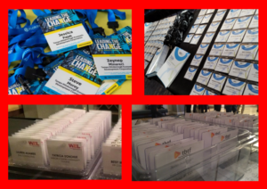
What should you have on a Name Badge?
- Conference Theme – keep your branding consistent by adding the conference theme to the top or the bottom of your conference badge
- First Name First – First name should be on its own line and it should clearly stand out.
- Full Name – Under the first name, print the full name in a smaller font
- Company Name – The company name should be slightly smaller than the individuals name
- Title – Most of our clients have moved away from printing titles on name badges. It helps break down barriers at networking events.
- Font – When it comes to fonts classic is best. Use Arial, Times Roman or Sans-Serif to ensure the font is easy to read and bigger is always better.
- Attendee Type – Consider adding a color band to the bottom of the badge to differentiate the types of attendees.
- The Flip – Use the back to print a high level schedule or important details. The back can also be utilized for sponsorship recognition by printing sponsor logo and important details (customized WiFi code or location of exclusive sponsored lounge).
Less is definitely more when it comes to conference badges. Not sure which options is the best for your event? Give us a call!
DeMarse Meetings & Events Agency – We Will Work Our Heels Off For You!


